Atomicon
Ideas That Live
A pulp-era creative identity and portfolio platform for an event promotions studio.
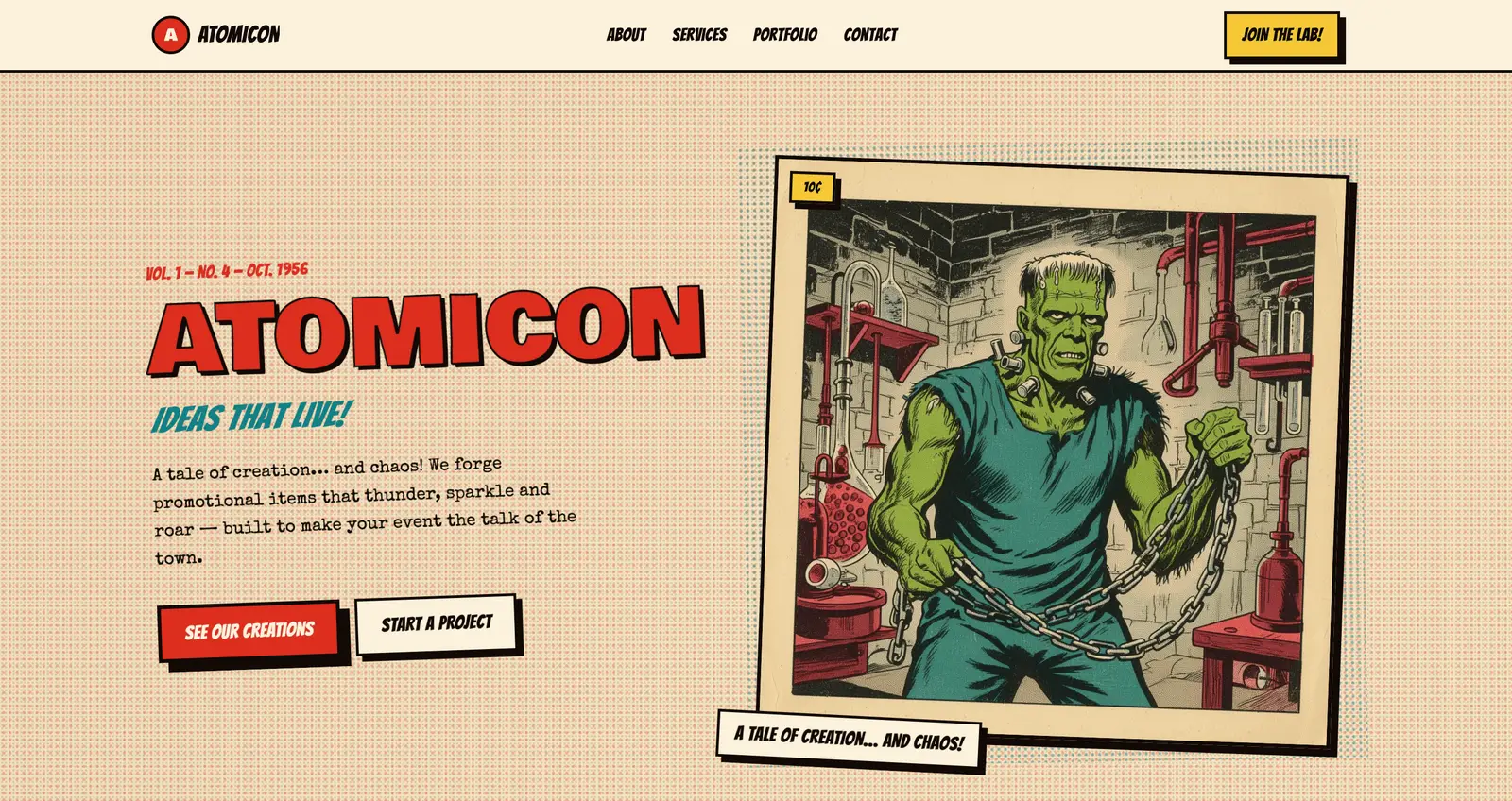
Atomicon builds promotional worlds — mascots, signage, merch and print — for events that need to be remembered. I led the brand system and portfolio platform, and oversaw the build through to launch.
- Client
- My role
- Discipline
- Launched
The challenge
Extraordinary work, invisible presentation
Atomicon's output was theatrical — fourteen-foot mascots, hand-painted stage backdrops, sold-out pin runs — but the studio had no way to show it. Work lived in phone galleries and client emails, and every new pitch started from zero.
The brief was to build a public face with the same voltage as the production floor, and a system the team could feed without a designer in the loop.
The approach
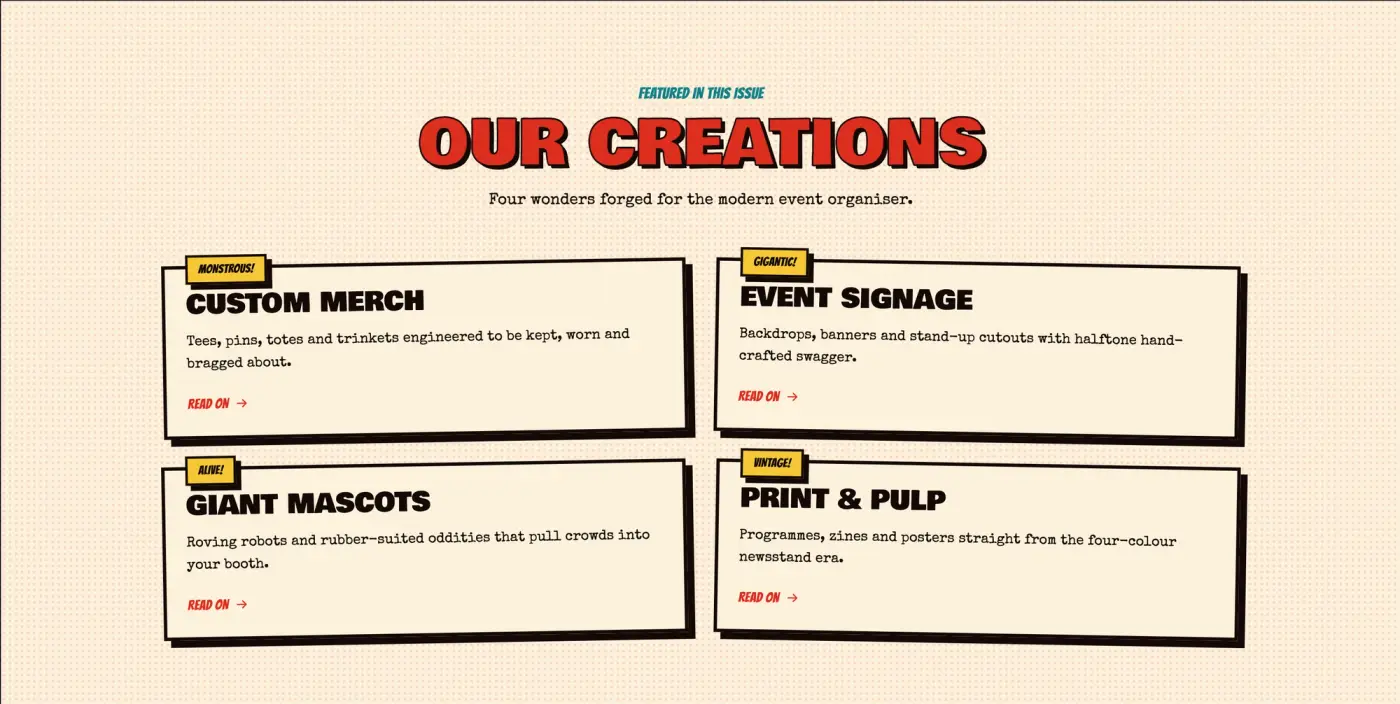
A 1950s pulp comic, engineered as a design system
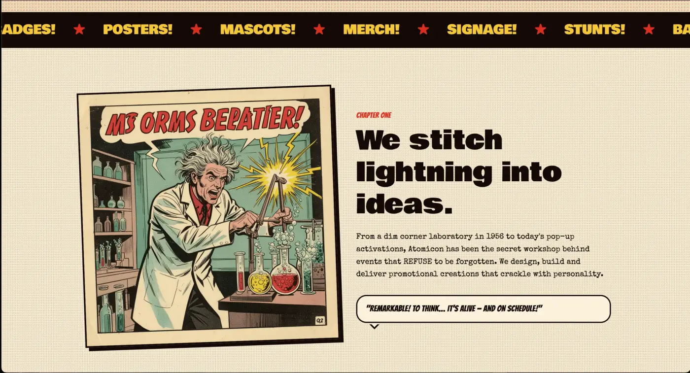
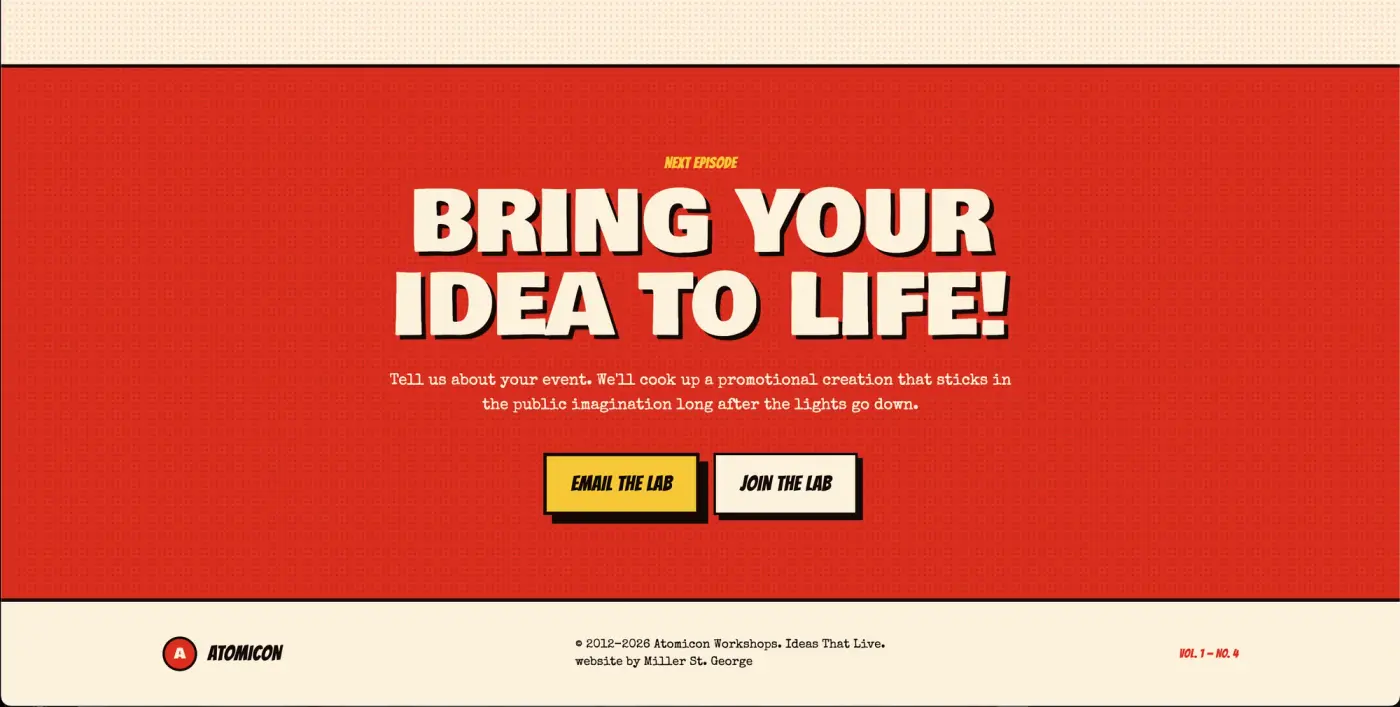
Halftone fields, hard ink borders, a red-teal-cream palette and display type set at cover-poster scale — codified into tokens rather than one-off layouts.
Identity
Pulp cover language
Platform
Portfolio engine
CMS
Editor-owned content
Capture
Enquiry flow
The outcome
A studio that finally looks like its work
The portfolio now carries the pitch. Prospective clients arrive already understanding the approach and style of Atomicon. The studio publishes new creations the week they ship rather than the quarter after.
Start of the work
Next →
Empirics - Insights & Brand Strategy
Empirics · Link Group